CSS Grid IS a grid framework
On October 10, 1994, Cascading Style Sheets (CSS) were proposed to style online documents. But then the Internet exploded with web apps and devices, and CSS fell behind. It was not designed to layout complex user interfaces on multiple screen sizes.
So, CSS frameworks came alive. And with a huge success, they did. A quick search on Github for CSS grid frameworks gives more than 500 repositories as a result.
Bootstrap was the most starred project on Github for a long time. Something was missing from CSS that made people reach out for frameworks as if their life depended on it.
But a lot has changed since CSS was first implemented and the layout of webpages was done with HTML tables. CSS has been catching up with the new requirements of the web, and it has done it very well.
Now we have custom properties (CSS Variables), a bunch of CSS Functions, and not only one, but two CSS modules for layout: Flexible Box Layout Module, and The Grid Layout Module.
With Flexbox and especially with CSS Grid, a powerful way for designing user interfaces using just native CSS is available to us, filling the gap that made all the CSS grid frameworks came alive.
There are a lot of tutorials and information on both and still, a lot of developers are investing more time in learning a Grid framework than in mastering the native layout tools now available with CSS. So, let’s see what they have to offer against a Grid Framework and why they should be your first choice on your path to becoming a master designing layouts.
The Flexible Box Layout Module
The Flexible Box Layout Module provides an efficient way to layout, align and distribute items inside a container.
A main characteristic of Flexbox is that it can work either horizontally or vertically, a huge advantage against regular layouts using block which is vertically based or inline which is horizontally based.
This is the first line of the Flexbox spec:
The specification describes a CSS box model optimized for user interface design.
Since it was developed for designing user interfaces, building a grid system using FlexBox is straightforward, it might take you about 14 minutes to understand how to do it, and less than five to do it yourself:
It is so powerful that even Bootstrap 4 is using Flexbox behind the scenes. This is their announcement from January 2017:
Bootstrap 4 is now flexbox by default! Flexbox is an immensely powerful layout tool, providing unparalleled flexibility and control to our grid system and core components.
If you want to deep dive into Flexbox, I couldn’t recommend enough the What The Flexbox?! course by Wes Bos available for free on YouTube.
The Net Ninja also has a free and very in-depth Flexbox course worth watching.
You should also keep at hand the visual guide on CSS Tricks as a reference when working with Flexbox: A complete guide to Flexbox.
CSS Grid Layout Module
While Flexbox is largely a one-dimensional system, with CSS Grid we have a two-dimensional native CSS layout system for the web, which allows us to easily recreate framework-based grids using just a few lines of CSS. This is the first line of the CSS Grid spec:
This CSS module defines a two-dimensional grid-based layout system, optimized for user interface design.
Although CSS Grid is gaining popularity it is still not widely used, less than 5% of the sites are using it according to the Chrome Platform Status.
Flexbox is more popular at this time and is fully supported by all browsers. CSS Grid is almost there.
And of course, Bootstrap 5 is already planning to use CSS Grid. So yeah, build it and they will come.
A better solution for Bootstrap might be to drop the twelve column grid system as proposed by Muhammad Rehan Saeed:
I’m trying to understand if the twelve column grid makes sense anymore to layout a page. The twelve column grid can only use a subset of the features of CSS Grid, without some utility classes added on to help and even then I’m not sure. If using React/Vue or some other framework, perhaps it’s time to dump the twelve column grid and use raw CSS Grid instead. If you did that, you no longer have to use HTML div’s to layout your page. What are your thoughts?
Probably the best place to start and get a good understanding of CSS Grid is the Grid by Example website by Rachel Andrew, a member of the CSS Working Group. You could also search YouTube for the many talks she has given on CSS Grid and related topics, you probably won’t regret it.
Again, both Wes Bos and the Net Ninja have very thorough and professional free courses on CSS Grid worth the time:
And if you are short of time and only want to visit one resource, this should be it: Jen Simmons Lab, by Jen Simmons. She is also a member of the CSS Working Group and one of the brilliant minds behind the coming revolution in graphic design on the web, so if this topic matters to you, you should listen to what she has to say.
Just scroll down her page to take a look at the amazing power of CSS Grid, and also be sure to check her YouTube channel Layout Land.
Conclusion
Now that CSS Grid is gaining traction, everyone is asking if we should replace grid framework layouts with CSS Grid. And almost every answer is that doing so is a huge win.
Dan Brown demonstrated how simple and efficient it is to replace a Bootstrap layout with CSS Grid in this insightful article, but warns us about using CSS Grid to recreate the Bootstrap Grid Framework, as we are restricting it of many of its real capabilities by doing so:
We don’t want to limit CSS Grid by shoehorning it into a syntax that will limit its potential. We were able to easily recreate the Bootstrap grid, but CSS Grid is so much more powerful than any grid system that came before it. That’s because it is a web-native solution built from the ground up.
Also, you can watch this video showing the benefits of rewriting a Bootstrap grid layout with CSS Grid.
As you can see, regarding file size, the Bootstrap version is 58 times larger than the native CSS one. Even after running the Bootstrap version over PurgeCSS the Bootstrap version is 3.4 times larger!
And that’s just regarding file sizes without taking into account that you are being restrained by the Bootstrap twelve columns grid system, and you should also consider the huge semantic gain by not having to rely on additional HTML markup just for layout purposes, like a div inside another div inside another div, etc. That’s not what markup is for, that’s what CSS is for.
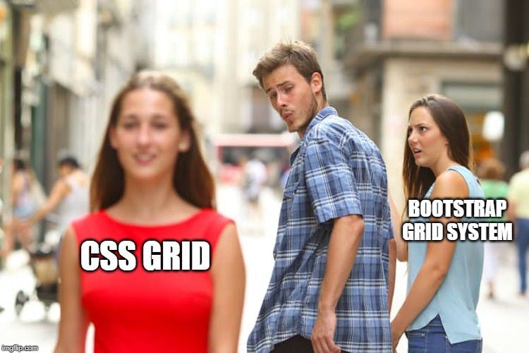
So the question might be if grid frameworks are still relevant when we have CSS Grid. Probably, the answer is no.
But there might be still some time before developers drop the use of grid frameworks as they are too used to them.
Morten Rand-Hendriksen couldn’t say it better on his great introductory talk to CSS Grid:
It’s interesting to think about where these frameworks will go next because the frameworks are very much rooted in this idea of using divs and containers to create these advanced layouts and with CSS grid a lot of that goes away. So if the frameworks were to migrate to CSS Grid they would have to break their standard practice and retrain all the people who use it. That might mean that these frameworks will date themselves out of the game.
And Rachel Andrew predicted all of this when presenting the CSS Grid framework in February 2017:
And the thing is what is going to happen? And I guarantee you what is going to happen is that just like Flexbox we are going to see everybody posting their grid layout based grid frameworks to GitHub. But please, if you think of doing that, think about whether that abstraction actually adds anything or whether it just adds a sort of weird layer of complexity on top of something because a lot the time we’re not gonna need a grid layout based grid framework because grid is a grid framework built right into CSS.
So, the next time you are thinking about using a grid framework like the one provided by Bootstrap to layout your website, think twice. You might be adding extra complexity and losing flexibility. You might be better just learning Flexbox and CSS Grid inside-out.
And if you are thinking about writing the next grid framework, remember that CSS Grid is a grid framework.
Additional resources
PS: This is not about CSS frameworks in general, they are still very useful in many circumstances, including Bootstrap. This is about CSS grid frameworks, like the twelve column grid system included with Bootstrap, and that’s just a part of what Bootstrap offers.